As September draws near, eager anticipation sets in for an invite all the way from California—a herald of the new characteristics the latest iPhone will bring, always teased via creative elements on the yearly invites.
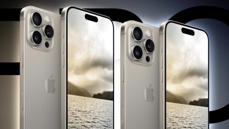
This year, the most conspicuous rumor is about a dedicated camera button poised to make its debut on the new iPhone’s chassis.
Design Evolution
In with the New: A Camera Button Takes the Stage
Adding buttons to a device’s body isn’t novel—Nokia’s Lumia series was known for its dedicated camera shutter button on the right edge of the phone. With the form factor of the iPhone remaining largely unchanged for seven years since the iPhone X, Apple had been quietly planning a change that’s now become apparent.
A Forgone Feature
Why the Action Button on the iPhone 15 Pro Went Unnoticed
The iPhone 15 Pro and Pro Max transformed the long-standing silent switch into a customizable Action button—a feature that initially sparked curiosity, especially among photographers who relished the thought of triggering the camera without unlocking their phones.

A Question of Ergonomics
The Stretch for Convenience
With demands for larger displays on the rise, phones have elongated since horizontal space is bound by the width of the human hand. The Action button, situated near the top of the left side, proves a stretch to reach and requires an adjustment in grip—far from natural positioning when one is quick to capture a photo.
Hidden in Plain Sight
The Overlooked Action Button
Subsequent to tweaking the initial excitement, the use of the Action button dwindled, with muscle memory driving users to instinctively unlock the screen and launch the camera the familiar way. Even on platforms like Reddit, accounts of forgetting the Action button abound, highlighting the shortfall in its design intuition.
The Struggle of Choice
Confusion in Customization
The Action button’s multi-functionality, while rich with potential, led to confusion—a familiar issue seen in the world of tech accessories. Even Xiaomi’s early accessory, Mi Key, an external button plugged into the headphone jack, faced a similar fate by introducing too much flexibility with the device interaction, complicating the inherent purpose of the button.
A Glance Back in Time
The Age of Physical Keys
Reflecting on the transition from feature phones, brimming with buttons for dialing, texting, and shortcuts, to the gradual dominance of touchscreens, it’s clear the industry has seen significant shifts. Phones like the Nokia 3310 offered menus navigated through a central button, and brands like BlackBerry made full keyboards a staple for business communication.

A Disruptive Revelation
Apple’s Groundbreaking Touch
In 2007, Apple shifted the paradigm with the original iPhone by eliminating the surplus of buttons, giving precedence to a single, large touch display. This transformation followed Dieter Rams’ philosophy of “Less but better,” which Apple had zealously adopted.
But years later, Apple’s design philosophy appears to oscillate slightly as they grapple with balancing design and functionality. Introducing complex functionalities within buttons seems contrary to the ethos once championed.
The Philosophical Shift
Returning to Roots or Forging a New Path?
From Jony Ive’s minimalist influence to the introduction of functional changes by Evans Hankey after his departure, Apple’s design approach evolves, seemingly torn between two eras. With Molly Anderson now at the helm, lauded for harmonizing aesthetics with productivity, she faces the challenge of ushering in new design choices while addressing the contention around functionality.
The Heart of the Matter
Practicality vs. Aesthetic
The iPhone 15 Pro’s Action button perhaps encapsulates this fluctuation in Apple’s design philosophy. And with Anderson leading the charge, the incorporation of a new camera button into iPhone 16 Pro evokes comparisons to the decisive and unambiguous steps taken seventeen years prior, hinting at Apple’s current hesitation between ‘design’ and ‘utility’.


Discussion about this post